Wireframes
Initial wireframes were sketched on paper to explore layout and flow before moving into digital. The focus was on establishing clear information hierarchy and intuitive navigation across the five core screens.
Paper Wireframes
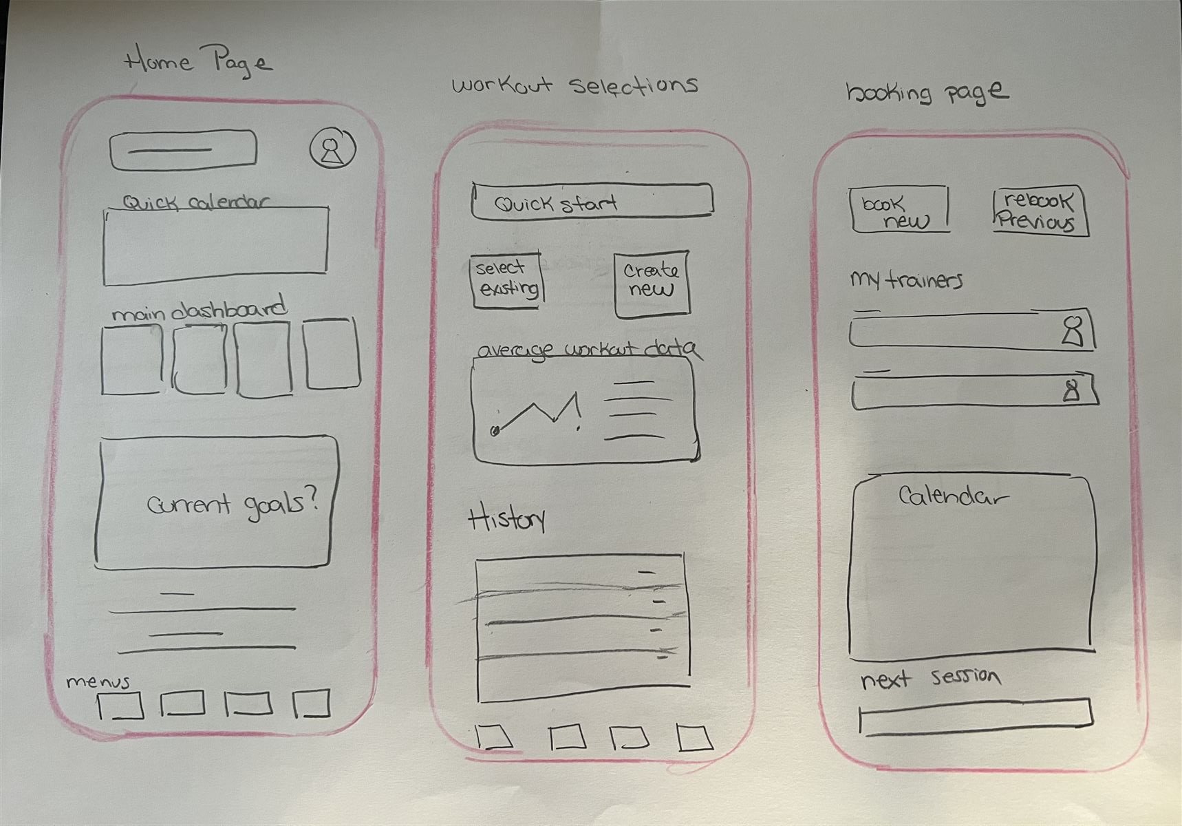 Home · Workout Selection · Booking
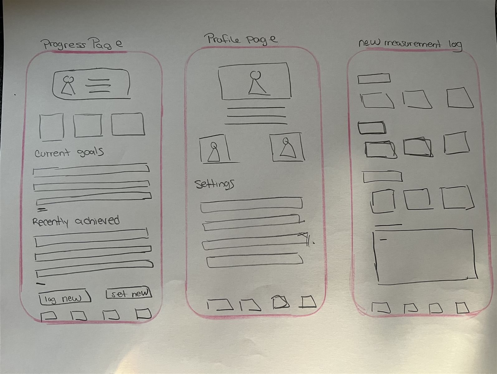 Progress · Profile · Measurement Log
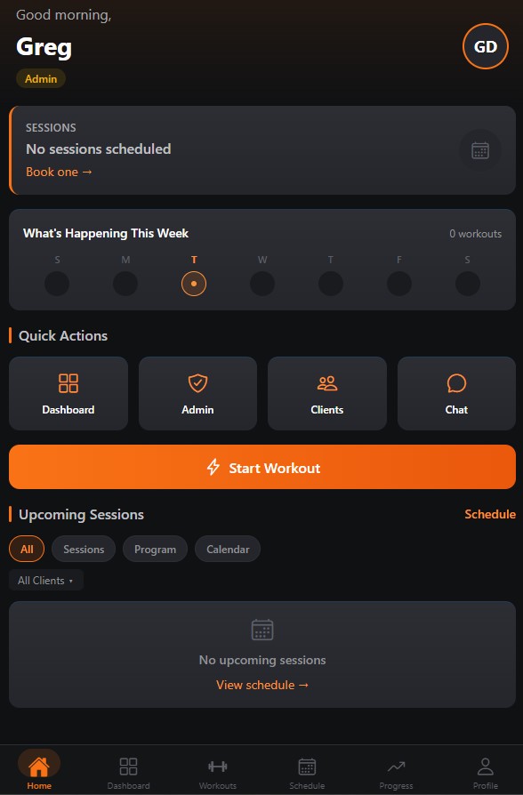
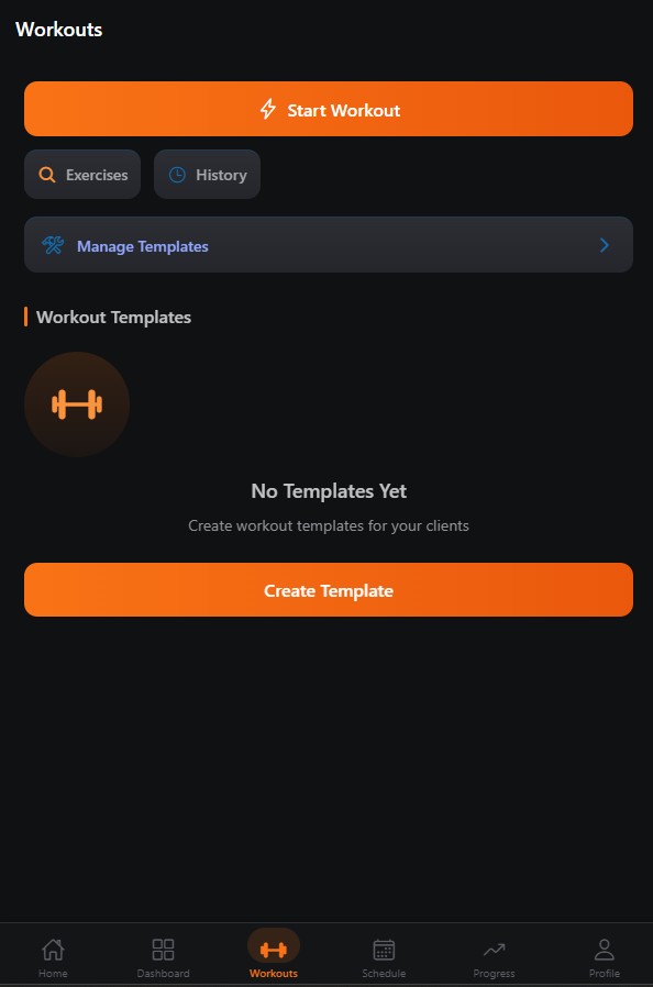
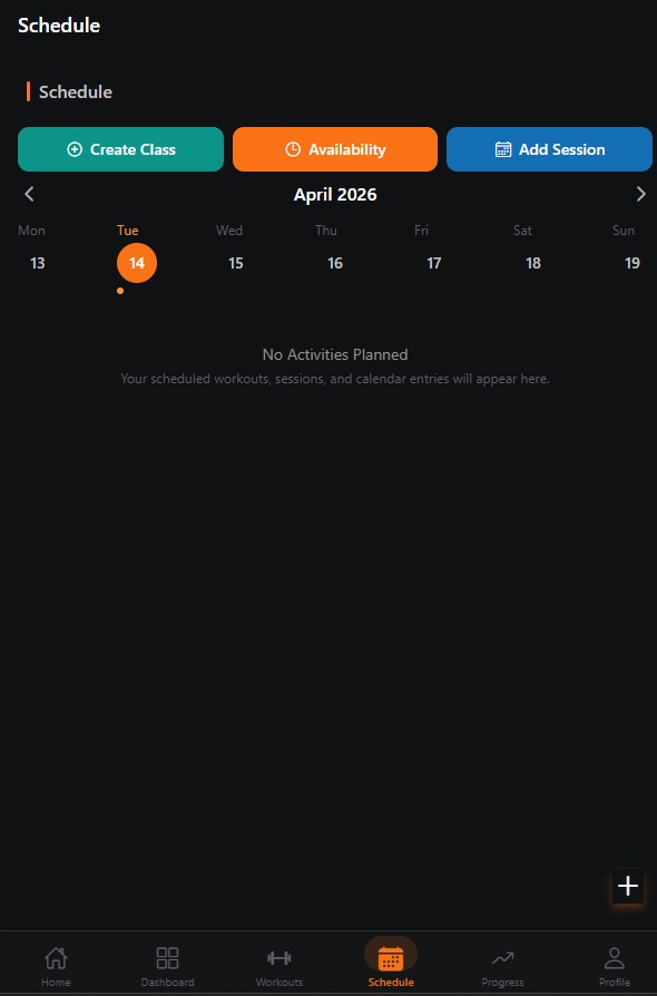
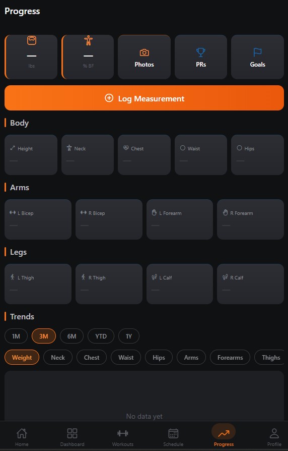
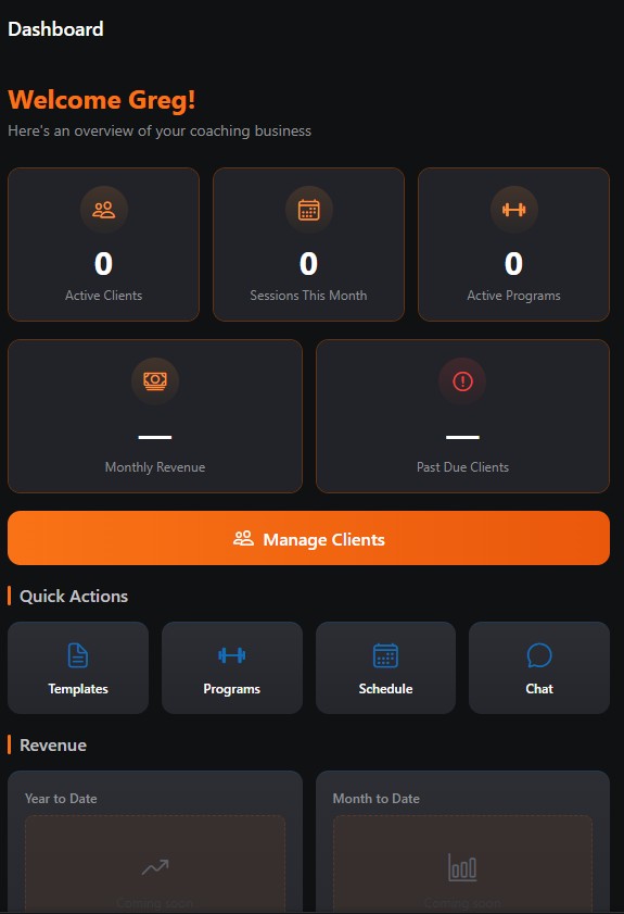
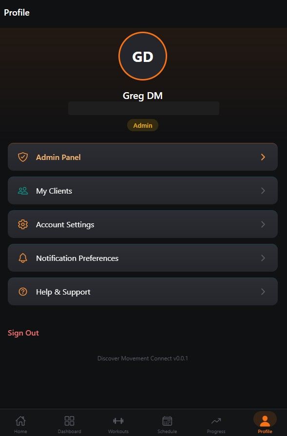
Digital Wireframes
Paper sketches were translated into clean digital wireframes, focusing on layout structure, component placement, and user flow without the distraction of color or branding.
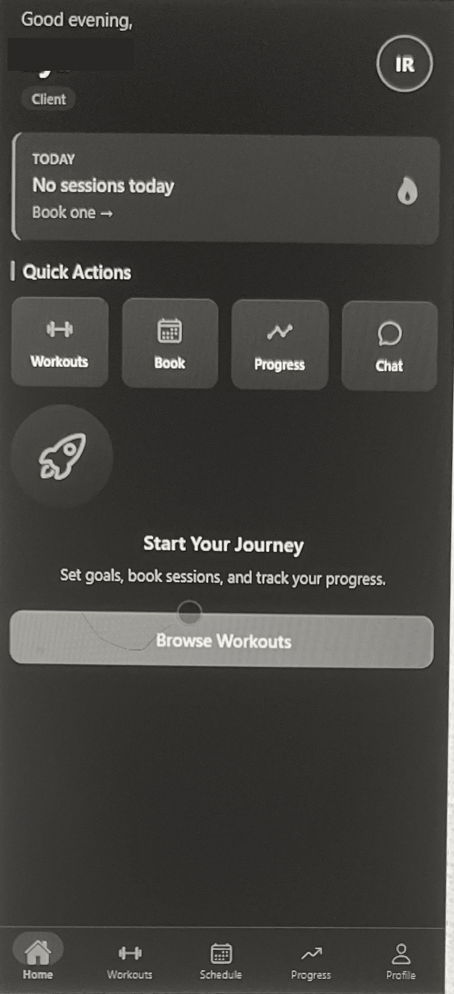 Home
Home
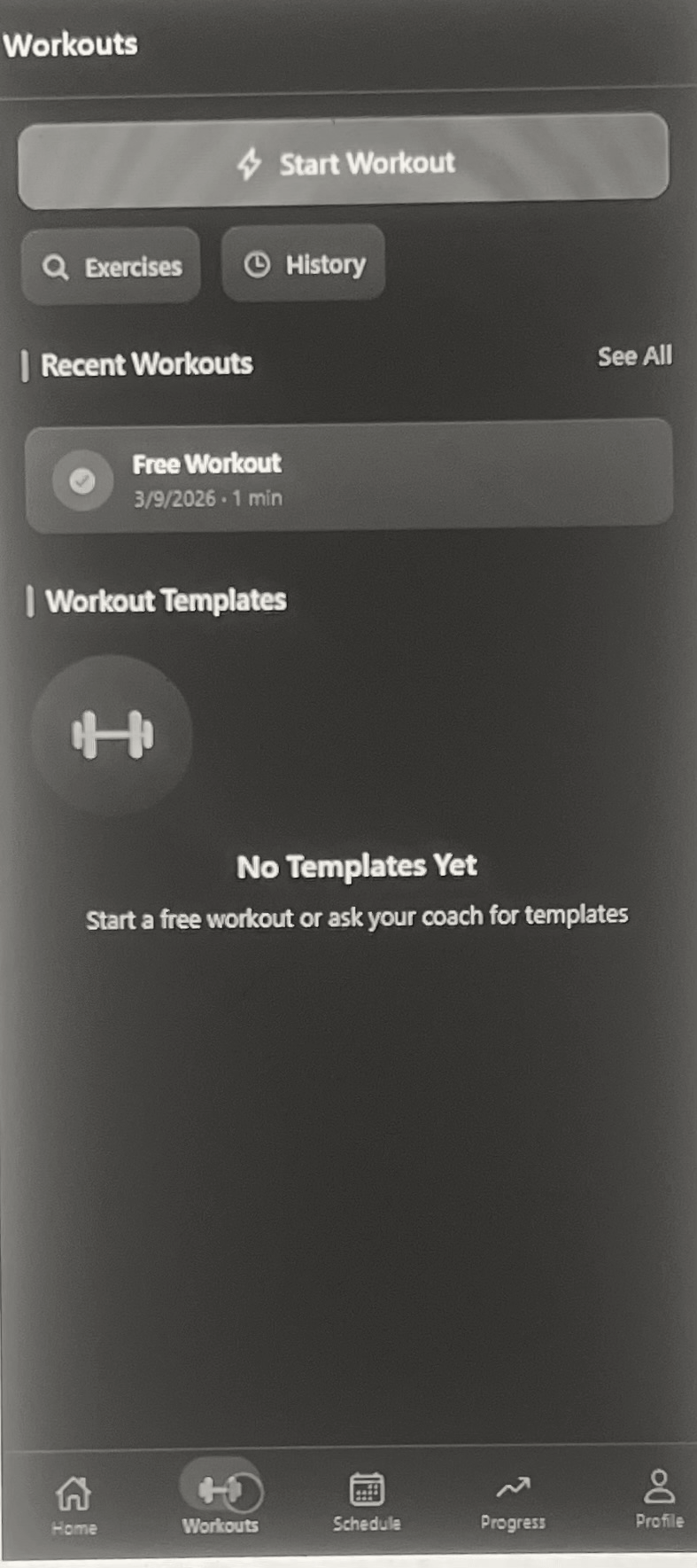 Workouts
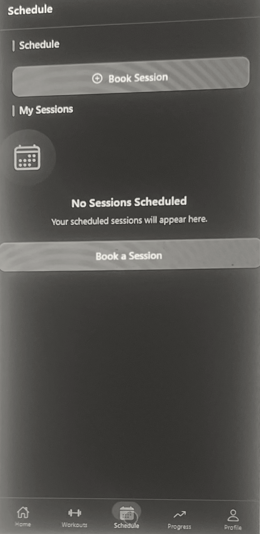 Schedule
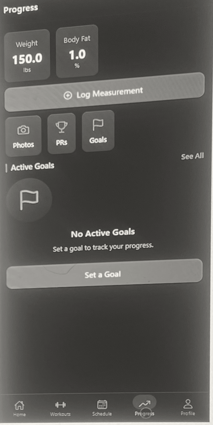 Progress
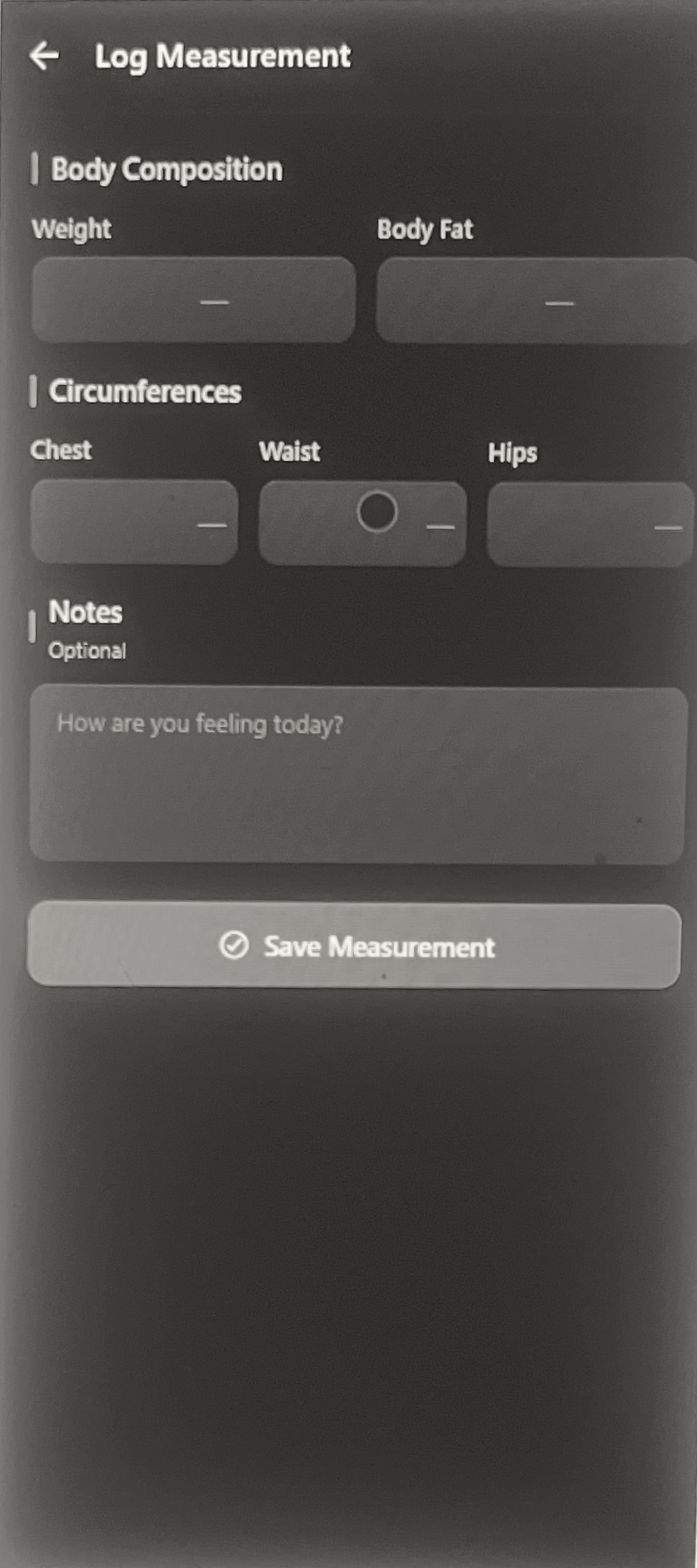 Measurement Log
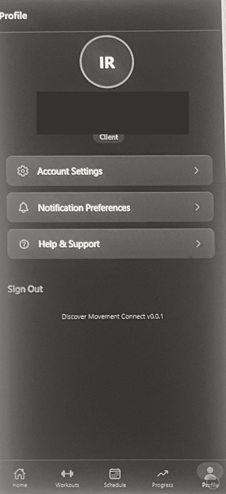 Profile